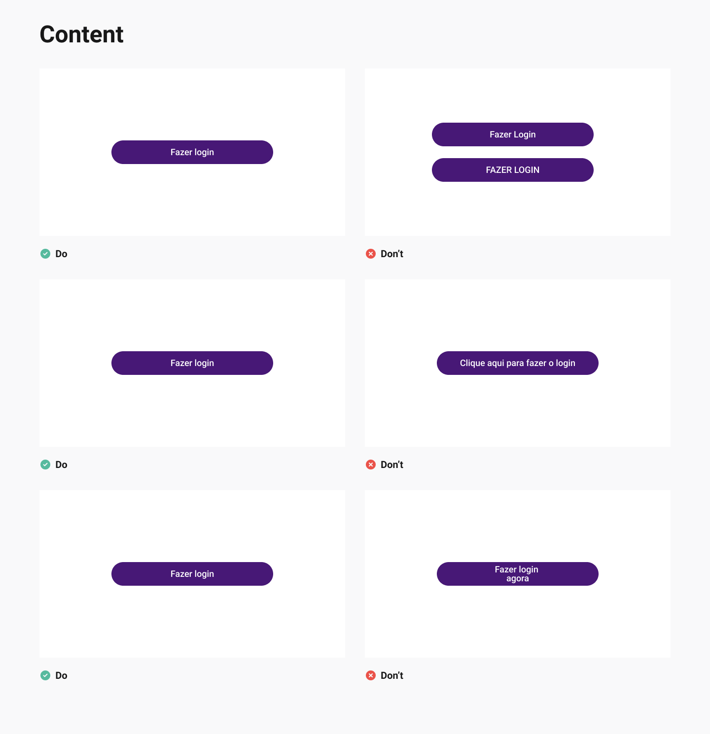
Building a design system

Vizir Software Studio
2021
Design System

Overview

the company obtained many clients in the Banking project. Thus, it was necessary to create a Design System, as the product was scaling up very quickly. With this construction, we can consistently build future functionality.

The challenge

Building a Design System is challenging, especially trying to convince your company that your product is in need of one. And working in a Tech company with only two designers and over 100 developers (including the founders) didn't seem as easy to convince as we wanted. First, the word "Design" in the name doesn't look promising for the rest of the team.What we did was to teach that it is just a label, but that everyone has to have a voice, developers, designers and all the stakeholders that are part of the product. And everyone must participate from day zero.Another thing was to question ourselves the need of Atomic Design. Of course it is a methodology that inspired the creation of the Design System and we vehemently respect it and those who use it. In our case, we are very much in doubt about what turns out to be an Atom, a molecule and what is a template is. So we ended up using Meiuca's method, in which in the end there are Design Tokens, from which we create the base components that are the indivisible parts of our interface and then the components, which are the more composite elements.

We also adopted from Meiuca, the Design System of three layers: the first one is the Design System Core, which are shared components among all products of the same language, it is our main library. The second layer is what is called Team Components, where each of the teams or products has the freedom to create components that help satisfy their particular product experience. And finally, the third and last layer which is the Not in Design System, which are those components that are created from the outside, which means that if the metrics of this product are low, and the interaction radically decreases the churn of that product, so, this layer makes sense being the last one, since we can open exceptions. Our team can also measure if a component made by the second layer (Team Components) can be useful for other teams, this same component can be promoted to Core in the future.

Project or product? 

The Design System has to be seen as a product, not a project. A project has an end date to finish and it ends up being kept in a drawer. A product will always evolve, as will the Design System that is scalable and will always be updated. That's why it's important that we name it. And so, Haus was born.

Haus: the Design System of the Banking

The name Haus came in honor of the Bauhaus, avant-garde German school. The movement embodies the ideal and the project of uniting engineers, architects, painters, designers, etc. researching and building prototypes to be produced on an industrial scale. We thought of calling it Bauhaus, but not to be something too linked to design only, we thought of the Haus variation, which means house in German, and that's where all the components that will be used in the project platform would be.With the name made, we went after each person responsible for part of the products and mapped their pain, because that way, we were much more sure that having the Haus would be beneficial for everyone. For example, we saw that our design team suffered a lot with component inconsistencies, at the development squad there was a lot of rework and finally, it left the business with low productivity.
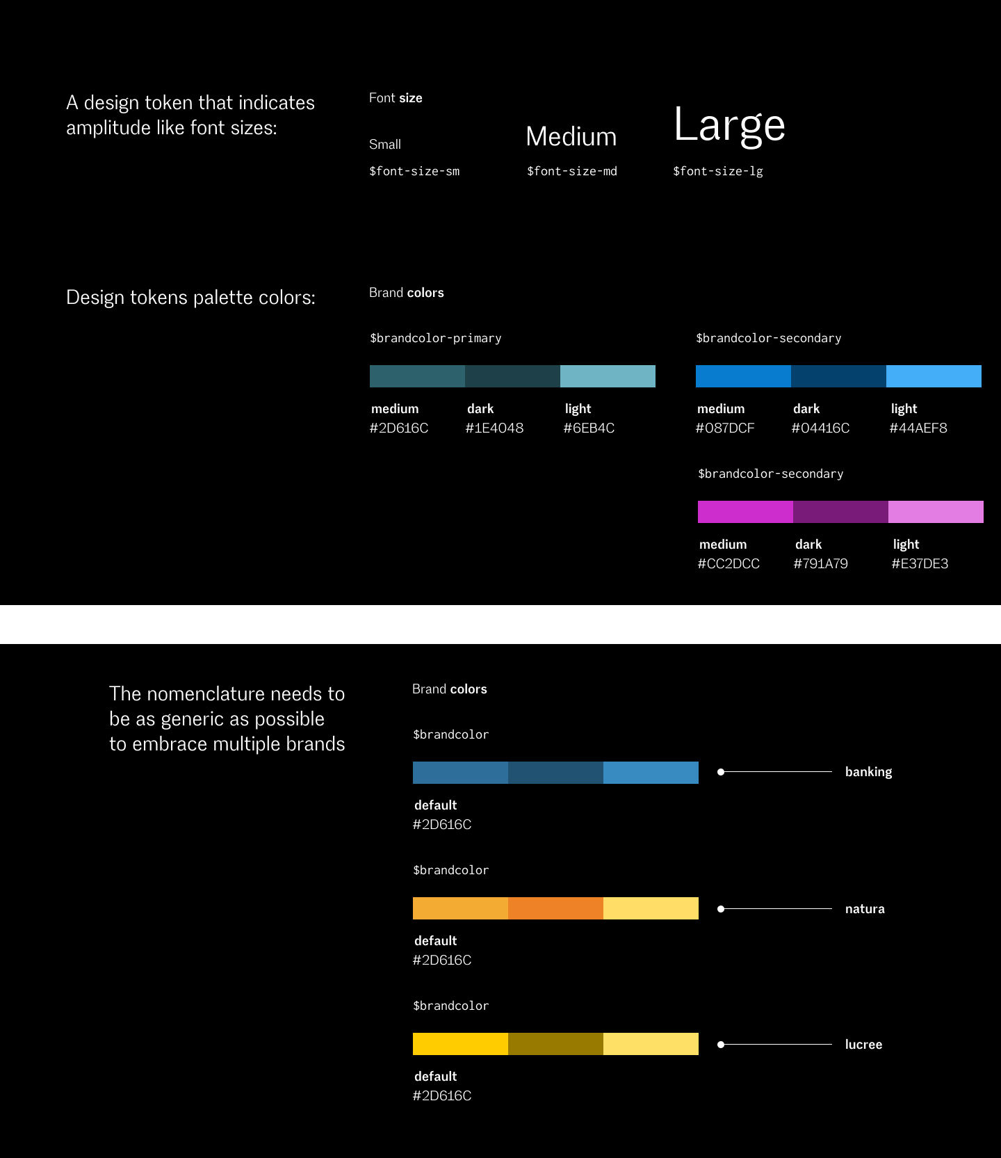
Component Inventory: visibility of inconsistencies

The next step was to make an inventory of components that currently exist in the product. The inventory served to discover the needs of the Design System and create a backlog for its components. Also, we saw how clear it became about inconsistencies within the Banking application today.

Another thing we did was mapping the base components and the components. Base components are smaller parts like the Image, Heading, a button or subtitle. Components are the most complex components, like a card where inside it, several base components are formed.

Design tokens

The focus of Design Tokens is to standardize our style variables across our libraries and make everything 100% mirrored between design and technology. It's important not to match the variables, Blue cannot be called Blue. It is very important that they are as semantic as possible to help both with maintenance and template logic. The logic is that design tokens are a dependency of our libraries and that we can update in one place and change all our products and technologies.

The style semantic variables are all colors, typography, edge thickness and roundness, opacity, shadow levels, etc. The variable is the color pixel or hexadecimal for example. Semantics is the actual name of our token and it gives a clue as to who it is on a scale.

Another importance of the Design Token is the logic template, which is a scenario of our currently project which embraces multiple brands, so it is important that the nomenclature is as generic as possible so that we only change the variables.


The handoff

The handoff process is more manual. Understanding the Design Tokens to compose the components and their states and behaviors is to reach a common place with the team, making it as optimized as possible.In this case, the developer won't inspect anything, so we sit down with them and talk about how each component will work, as well as a recipe. And we always need to come up with a common denominator so that components become 100% mirrored.

Documentation (WIP)

Finally, we were doing the documentation, which was a necessary process to rescue the mindset that the Design System is a product since thinking like that, we can imagine how and what to talk to our final user, that is, everyone who will daily use it. What is the requirement for designers? And for developers? And for the Product Owner, Product Manager, etc. It is essential to understand what the team needs, not necessarily documenting extensively, as it is difficult for everyone to read it, and the leaner form may lack information. One of the things we did was get together to see what it takes to scale design globally across the enterprise.

So, we made documentation to present a little of the product's design system and the technical documentation of development and design as use and best practices (made this one in Figma).

It is practically impossible to foresee all the doubts when documenting. Hence, understanding and monitoring your pains helps improve the documentation, making it easier to have leaner documentation without being lengthy and extensive. With that, we can constantly evolve and understand how people are reacting to it.

NEXT

Shaping a dating app

Mango X
2022
Vancouver, Canada
Product Design
See Full Project

A dating app for people who want to date seriously.